
Austin Web Design: Build a Website That Converts Visitors Into Customers
Your website is getting visitors. Google Analytics confirms it. Maybe 500 people last month, maybe 5,000. Doesn’t matter because here’s the part that keeps you up at night: almost none of them are becoming customers.
They land on your homepage, click around for thirty seconds, and disappear forever. Your contact form sits empty. Your phone stays quiet. Meanwhile, your competitor down the street with the uglier website is booking clients consistently. What are they doing that you’re not, and how are they benefiting from professional Austin web design in ways you might be missing?
The answer usually isn’t what you think. It’s not about flashier graphics or trendier designs. Most conversion problems come down to fundamental mistakes that have nothing to do with aesthetics and everything to do with understanding how people actually make decisions online.
Table of Contents
The First Seven Seconds That Make or Break Everything
When someone lands on your site, their brain immediately starts asking questions. What does this company do? Can they solve my problem? Should I trust them? You’ve got roughly seven seconds to answer before they bounce harder than a check from that client who always “forgot” to pay.
Your hero section (that’s the first thing people see) needs to nail three things instantly. What you do, who you help, and what action they should take. Skip the corporate word salad about “synergizing solutions” and “leveraging innovation.” Nobody wakes up thinking “I need someone to leverage my innovation today.”
Instead, try something radical: say what you do in plain English. “Keeping Your Network Secure Daily” “Custom Merchandise That Gets You Seen.” Clear beats clever every single time. Your visitors should understand your value proposition faster than they can microwave leftovers.
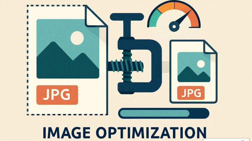
Load speed matters more than you think. Every second of delay costs you conversions. Three seconds to load? You just lost half your mobile visitors. They’re already on your competitor’s site, credit card in hand. Compress those images, minimize that code, and maybe reconsider whether you really need that auto playing video background that nobody asked for.
Designing for Humans Who Skim, Not Robots Who Read
Nobody reads websites anymore. They skim like they’re speed dating through content, looking for something that catches their eye. Your design needs to accommodate this reality or watch conversion rates flatline.
Break up text walls with headers that actually mean something. “Our Services” tells visitors nothing. “How We Triple Your Website Traffic in 90 Days” makes them stop scrolling. Use bullet points like they’re going out of style. Short paragraphs that don’t require a coffee break to finish. White space that lets content breathe instead of suffocating visitors with information overload.
Your calls to action need to stand out! Not just in color (though that helps) but in clarity. “Submit” is what you do to parking tickets. “Get Your Free Website Audit” tells people exactly what happens next. Every button should answer the visitor’s question: “What’s in it for me if I click this?”
Mobile design isn’t optional anymore. More people browse on phones than desktops, yet some sites still treat mobile like an afterthought. If your site requires pinching and zooming like it’s 2010, you’re hemorrhaging conversions. Thumb-friendly buttons, readable fonts without squinting, forms that don’t require a stylus to complete. Basic stuff that somehow isn’t basic enough.
The SEO and Technical Foundation Nobody Sees but Everyone Needs
Beautiful design means nothing if nobody finds your site. SEO isn’t some mystical art requiring animal sacrifices under a full moon. It’s about making your site easy for Google to understand and users to navigate.
Page titles and meta descriptions that actually describe your pages. URLs that make sense instead of looking like someone fell asleep on the keyboard. Internal linking that guides visitors deeper into your site instead of abandoning them on islands of content.
Schema markup helps search engines understand your content better. Local SEO puts you in front of nearby customers. Site architecture that makes sense to humans and crawlers alike. This behind-the-scenes work determines whether you show up when someone searches for what you sell.
Common Conversion Killers You Can Fix Today
You don’t need a complete redesign to improve conversions. These quick fixes often deliver immediate results:
Remove the mystery from your contact process.
If your contact form has twelve fields asking for information you don’t actually need, cut it down to name, email, phone, and a message box. Every extra field reduces completion rates.
Make your phone number clickable on mobile.
Sounds obvious but you’d be amazed how many business websites make mobile users manually type phone numbers. That’s conversion friction you’re creating for no reason.
Add chat functionality for immediate questions.
Whether it’s live chat during business hours or a chatbot that captures information after hours, giving visitors an immediate response option catches people while they’re actively interested.
Speed up your forms with autocomplete and smart defaults.
The easier you make it to complete actions, the more people will complete them. Use autofill attributes, minimize required fields, provide clear error messages.
Test your contact methods regularly.
Submit your own contact form monthly. Call your business number from different devices. Make sure your “request a quote” process actually works. Broken conversion paths are shockingly common.
Making Your Website Work For Your Business
Your website should be your hardest-working salesperson. It never sleeps, never takes vacation, and can talk to unlimited prospects simultaneously. But only if it’s actually built to convert visitors instead of just looking nice in screenshots, which is where tailored website development and digital marketing in Austin TX can make a measurable difference.
The difference between a website that generates customers and one that just exists online isn’t mysterious. It’s about clarity over cleverness, user needs over your preferences, and strategic thinking over design trends, supported by a website health check in Austin TX to keep everything performing at its best.
You don’t need the fanciest website in your industry. You need one that communicates clearly, loads quickly, works on every device, and makes it ridiculously easy for qualified visitors to take the next step. Get those fundamentals right and conversions follow naturally.
Most businesses already have enough traffic to generate meaningful results. They’re just losing those visitors to fixable problems. Better headlines, clearer calls to action, faster loading, simpler navigation. These aren’t complicated fixes, but they require honest assessment of what’s actually working versus what you hope is working, often with the guidance of experienced Austin web designers who understand both aesthetics and performance.
If your website isn’t converting visitors into customers at a rate that makes you happy, something specific is broken. The good news? Specific problems have specific solutions. You just need to identify them and fix them systematically instead of hoping a prettier design magically solves everything.
Frequently Asked Questions About Web Development
Is it worth hiring a designer or agent for web development and SEO or can we DIY it?
Depends on your skills, time, and business priorities. DIY website builders make basic sites accessible, but creating something that actually converts requires understanding user psychology, search behavior, technical optimization, and design principles. Most business owners are better off focusing on running their business while professionals handle the specialized work of building and optimizing a site that generates customers. The ROI on Austin website development typically pays for itself quickly if done right.
How long should my homepage be?
Long enough to convince visitors but short enough to maintain attention. Focus on covering key points above the fold, then provide details for those who scroll. Most conversions happen in the first two screen lengths, so front load your value proposition.
What’s more important: design or content?
Neither wins alone. Gorgeous design with garbage content is like a Ferrari with no engine. Great content with terrible design is like serving gourmet food on paper plates. You need both working together to convert effectively.
How many calls to action should each page have?
One primary CTA per screen view, with secondary options that don’t compete. Too many choices paralyze visitors. Guide them toward one main action while providing alternatives for those not ready to commit.
Should I show prices on my website?
If you’re competing on value, yes. If you provide custom solutions, show ranges or starting prices. Hiding prices entirely makes visitors assume you’re expensive and sends them searching elsewhere for transparency.
How do I know if my website is actually converting?
Install analytics and track everything. Conversion rate, bounce rate, time on site, path to purchase. Set up goal tracking for form submissions, phone calls, and sales. Without data, you’re guessing. With data, you’re improving.
How long does it take to see conversion improvements after updating our website?
Some changes deliver immediate results within days, like fixing broken contact forms or improving page speed. Deeper improvements from better messaging and user experience typically show measurable results within 30 to 60 days as you accumulate enough data to see patterns. SEO-driven improvements take longer, usually 3 to 6 months, because rankings take time to change. Track metrics weekly but judge success over months, not days.
What’s a good website conversion rate to aim for?
It varies dramatically by industry and what you’re counting as a conversion, but for most service businesses, converting 2% to 5% of website visitors into leads (not customers, just inquiries) is typical. If you’re under 1%, there’s definitely room for improvement. Over 5% is excellent. Focus less on industry benchmarks and more on improving your own baseline over time.
Should we redesign our entire website or just fix specific conversion problems?
Start with targeted fixes to your current site unless it’s truly outdated (think 5+ years old with broken mobile experience). Often, improving headlines, streamlining navigation, fixing forms, and optimizing key pages delivers better ROI than a complete redesign. Redesign when your technology is outdated, your site doesn’t work on mobile, or your business has changed significantly. Otherwise, optimize what you have.
How do we know which pages are hurting our conversions?
Google Analytics shows you where visitors drop off. Look at your highest traffic pages and check bounce rates and time on page. Pages with high traffic but terrible engagement are conversion killers. Heat mapping tools show where people click and how far they scroll. Form analytics reveal where people abandon your contact process. This data tells you exactly where to focus improvement efforts.
Table of Contents


