

Infographic: Choosing the Right Colors for Your Website
When making your website is an important but difficult task, this infographic is designed to guide you through all the steps of picking a color.
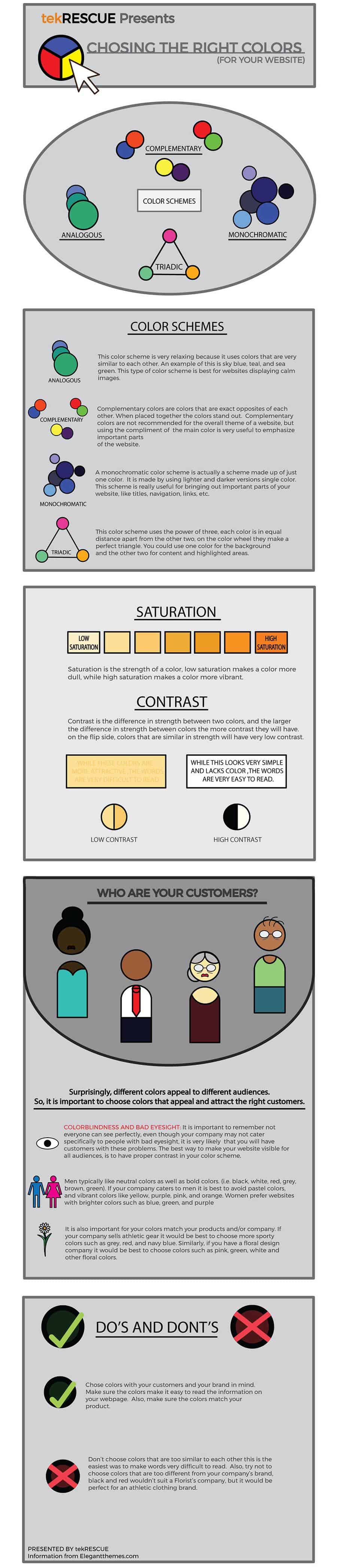
Table of Contents
COLOR SCHEMES
ANALOGOUS
This color scheme is very relaxing because it uses colors that are very similar to each other. An example of this is sky blue, teal, and sea green. This type of color scheme is best for websites displaying calm images.
COMPLEMENTARY

Complementary colors are colors that are exact opposites of each other. When placed together the colors stand out. Complementary colors are not recommended for the overall theme of a website, but using the compliment of the main color is very useful to emphasize important parts
of the website.
MONOCHROMATIC
A monochromatic color scheme is actually a scheme made up of just one color. It is made by using lighter and darker versions single color. This scheme is really useful for bringing out important parts of your website, like titles, navigation, links, etc.
TRIADIC
This color scheme uses the power of three, each color is in equal distance apart from the other two, on the color wheel they make a perfect triangle. You could use one color for the background
and the other two for content and highlighted areas.
SATURATION
Saturation is the strength of a color, low saturation makes a color more dull, while high saturation makes a color more vibrant.
CONTRAST

Contrast is the difference in strength between two colors, and the larger the difference in strength between colors the more contrast they will have. on the flip side, colors that are similar in strength will have very low contrast.
WHO ARE YOUR CUSTOMERS?
Surprisingly, different colors appeal to different audiences.
So, it is important to choose colors that appeal and attract the right customers.
COLORBLINDNESS AND BAD EYESIGHT:It is important to remember not everyone can see perfectly, even though your company may not cater specifically to people with bad eyesight, it is very likely that you will have customers with these problems. The best way to make your website visible for all audiences, is to have proper contrast in your color scheme.
Men typically like neutral colors as well as bold colors. (i.e. black, white, red, grey, brown, green). If your company caters to men it is best to avoid pastel colors, and vibrant colors like yellow, purple, pink, and orange. Women prefer websites with brighter colors such as blue, green, and purple.
It is also important for your colors match your products and/or company. If your company sells athletic gear it would be best to choose more sporty colors such as grey, red, and navy blue. Similarly, if you have a floral design company it would be best to choose colors such as pink, green, white and other floral colors.
DO’S AND DONT’S
DO’S

Chose colors with your customers and your brand in mind. Make sure the colors make it easy to read the information on your webpage. Also, make sure the colors match your product.
DONT’S
Don’t choose colors that are too similar to each other this is the easiest was to make words very difficult to read. Also, try not to choose colors that are too different from your company’s brand, black and red wouldn’t suit a Florist’s company, but it would be perfect for an athletic clothing brand.
Table of Contents