
[INFOGRAPHIC] Mobile Responsive Websites
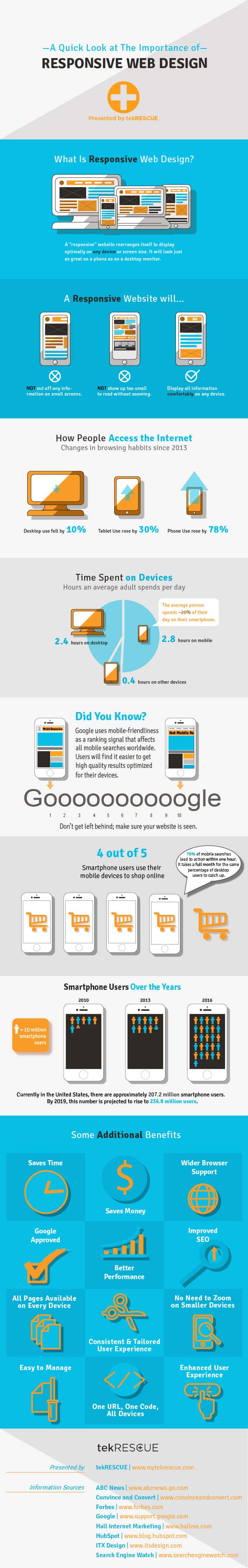
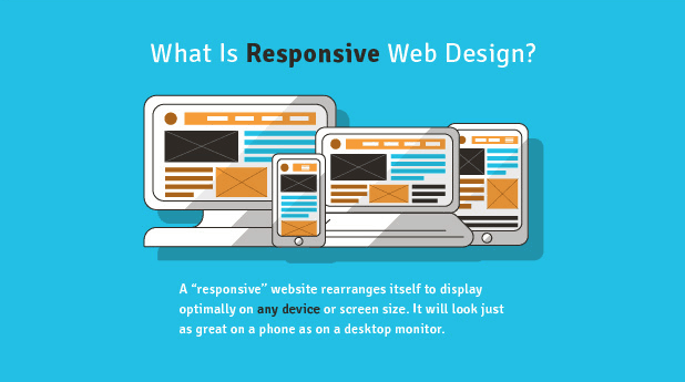
A “responsive” website is one that rearranges itself to display optimally on any device or screen size. Since 2013, phone use rose by 78% while desktop use fell by 10%. Because of this, it is very important for businesses to keep up with the internet trend and make their site mobile responsive. The average person spends 20% of their day on their smartphone, which is about 2.8 hours a day!
Google uses mobile-friendliness as a ranking signal that affects all mobile searches worldwide so that users find it easier to get high quality results optimized for their devices. Also, 70% of mobile searches lead to action within one hour while it takes nearly a full month for the same percentage for desktop users to catch up.
Some of the additional benefits of having a mobile responsive site are:
- Saves time
- Save money
- Wider Browser Support
- Improves SEO
- All pages available on every device
- No need to zoom on smaller devices
- One URL, One Code, All Devices