
Typography on the Web in 2019
A website may exist thanks to technology that has emerged very recently, but the design principles behind a great website are timeless. Conveying information to the viewer is still the most essential problem for a web designer to solve, and no element of a website conveys more information than its typography.
The trend with typography on the web has been that as web technologies evolve, more and more techniques become available to designers. It seems that with every new innovation in website and digital type technologies, web designers inch closer to having the full arsenal of tools available to print designers. With this trend in mind, we’ll take a look at the state of typography on the web, exploring what’s available to designers as well as what challenges they’re still faced with.
Breaking Free of Web-Safe Fonts
One of the most significant breakthroughs in typography on the web is in the number of typefaces available for designers to play around with. Traditionally, web designers were limited to a small handful of “web safe fonts,” or system fonts that came bundled with Windows computers and Macs. Typefaces like Arial, Helvetica, Times New Roman, Georgia, and a handful of others were the only fonts web designers could use if they wanted to deliver a consistent experience to site visitors.

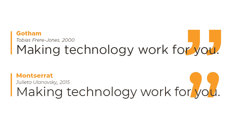
Services like Google Fonts completely revolutionized this landscape. With a vast library of well-made typefaces ready to be called with just a few simple lines of CSS, Google fonts has made it easy for web designers to use typeface styles they’d previously only dreamed of. From the Gotham-esque geometry of Montserrat to the Bodoni-reminiscent elegance of Playfair Display, Google fonts offer a decent alternative for all of the classic typefaces previously out of reach of web designers.
As convenient as Google Fonts are, sometimes a project calls for a very specific font that can’t be replaced by a Google font look-alike. Luckily, improvements in web browser technology and the ubiquity of high-speed Internet in recent years has made it not only possible but viable for web designers to upload their own font files to be served as part of the website content. This essentially allows for nearly any font to be represented on the web, provided it’s in the right digital format.
Innovations in Digital Typography
Web technologies aren’t the only tool expanding what web designers can do with typography . In recent years, we’ve seen all kinds of exciting new innovations in digital typefaces themselves. From hand-made ligatures to beautiful glyphs and stylistic character alternatives, contemporary digital typeface designers are bridging the gap between digital and traditional typography. Combine this with web designers’ freedom to upload and use any digital typeface imaginable, and it’s not difficult to see why web typography is getting closer and closer to the subtlety and beauty of its print counterpart.
Ever-Growing CSS & JavaScript Support
The final technological advancement we’ll go over is the ever-expanding possibilities presented by CSS and JavaScript. As web browsers continue to become more powerful, new CSS properties and JavaScript methods that allow web designers more control over their typography are becoming standard. With these new standards, many typographic techniques that were previously only seen in print media are becoming not only possible but commonplace on the web.
Drop Caps are an excellent example of this. A staple of page layout since before the invention of moveable type, drop caps on the web was relegated to poorly supported experiments by CSS tinkerers throughout most of the web’s history. Fast forward to 2019, and now WordPress’ new Gutenberg editor allows anyone to set a drop cap by simply flipping a switch. Similarly, innovations in JavaScript such as the HTML5 Canvas API allow web designers to easily render text with strokes, gradients, and so much more.

The Challenges of Responsive Web Design
The general trend we’ve gone over so far is that, as web technologies progress, the typographic options available for web designers have opened up accordingly. Some technological advances, however, present more challenges than opportunities for typesetting on the web. One of these is the vast array of screen sizes web designers must account for in 2019.
As website design standards moved from static, fixed-width layouts to flexible and responsive layouts, it became impossible for designers to control every detail on a page layout. A typographic header that has a single line break on a desktop screen may have three or four line breaks when viewed on a phone. This inability to perfect every detail on a page layout means that web designers simply cannot achieve the level of finesse afforded to print designers.
Despite these challenges, this is an extremely exciting time to be a web designer. The gap between print design and web design is quickly closing as technology is giving web designers an ever-increasing toolkit to create beautiful typographic layouts. The web team here at tekRESCUE is certainly thrilled to be able to take advantage of these new tools, and we’re excited to see what the future has in store for the world of web design.


