Landing Page Design: Layout, Elements and Best Practices
A good landing page design does one job: it gets a visitor to take one specific action. Everything on the page, from the headline to the form, either supports that action or gets in its way. If you run a small business and pay for traffic, every element that competes with your call to action is money you are wasting.
This guide covers the layout that works, the elements to include, the rules for forms, mobile and accessibility, and how to read landing page examples without copying the wrong lessons.
Table of Contents
TL;DR
- A landing page is a standalone page with a single goal. Search Engine Land describes it as a page built to persuade visitors to take one specific action.
- Lead with a clear headline, a supporting subheadline, one visible call to action and a relevant image, all in the first screen.
- Keep forms short, explain why you ask for each sensitive field, and place trust cues near the button.
- Design for phones first: fast load, readable text, tap targets big enough for a thumb, and contrast that meets WCAG 2.2.
- Examples inspire, but your own page should match your ad, your offer and your audience.
Table of Contents
- What a landing page is, and what it is not
- The layout that guides the eye
- Landing page elements worth including
- Forms: collect less, explain more
- Mobile, speed and accessibility
- How to read landing page examples
- A step-by-step build order
- Perspective
- Where tekRESCUE fits
- FAQ
- Sources
What a landing page is, and what it is not
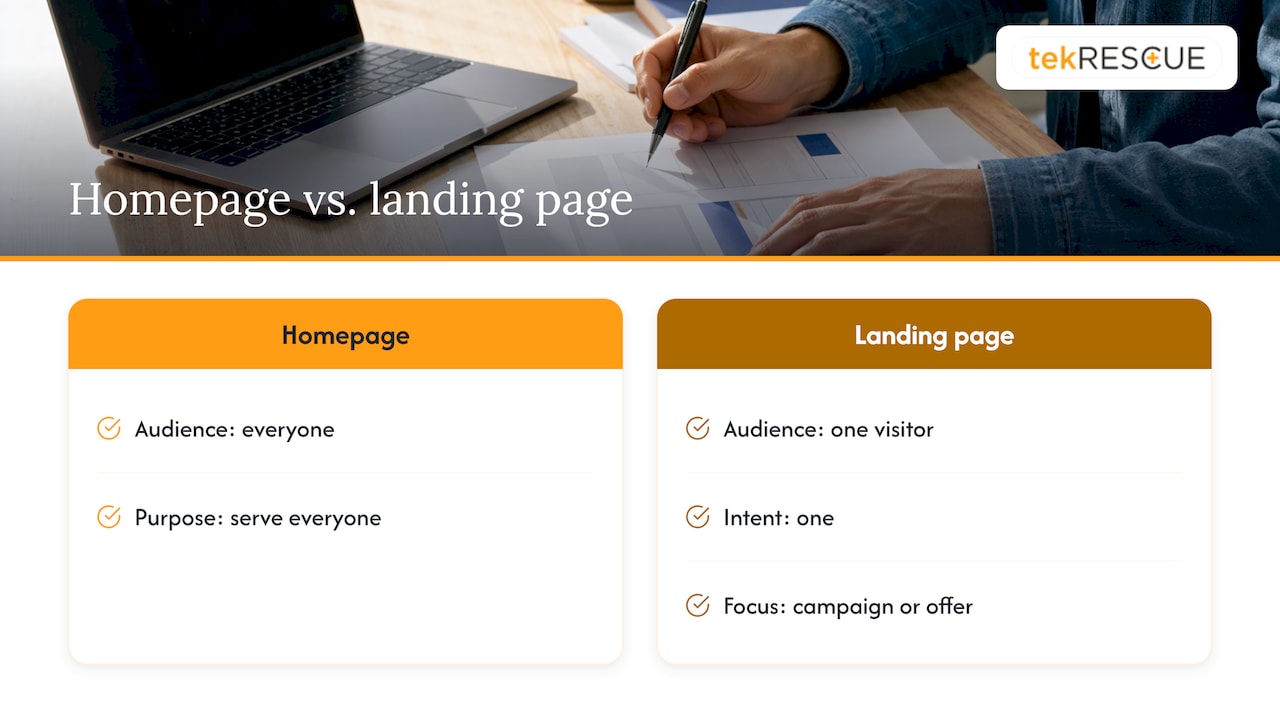
Your homepage tries to serve everyone. A landing page serves one visitor with one intent. Search Engine Land’s guide defines it as a dedicated page with a singular focus, where every element is crafted to support the campaign or offer it is tied to.
That single goal might be a quote request, a booking, a download, an event registration or a purchase. The page that sends someone to ten places gets none of them.
The U.S. Web Design System, the federal government’s design standard, gives practical direction for this kind of page. It advises keeping content simple, avoiding forms or side navigation, and removing unnecessary elements. If the page pushes a primary call to action, it suggests considering removing the header altogether.
That is the first design decision. Ask what the one action is, then delete anything that does not serve it. A full site menu is the usual first casualty.
The layout that guides the eye
People do not read landing pages like books. They scan. According to Search Engine Land, eyes jump to headlines, buttons and images first, which is why visual hierarchy matters: the most important thing on the page should be the most visible thing on the page.
The first screen
The top of the page carries most of the weight. Search Engine Land’s guide on landing pages for SEO and conversions says you have around 10 seconds to make a first impression. It recommends a header section with:
- A headline that defines the problem.
- A subheadline that explains the solution.
- A strong, visible call to action button.
- An optional soft call to action for visitors not ready to commit.
- A hero image that grabs attention and reinforces the message.
The same article adds a principle worth printing on your wall: clarity matters more than cleverness. Use concise messaging, limit distractions and keep a consistent call to action all the way down the page.
The scroll
Below the first screen, build a logical argument in the order a skeptical buyer asks questions:
- What is this? The offer, in a few lines or bullets.
- Why should I believe you? Testimonials, reviews, logos, credentials.
- What happens next? The steps after the click, so the action feels safe.
- Any objections? A short FAQ.
- Ready? A closing call to action that repeats the first one, in the same words.
Repeat the same action, not a different one. A page that asks for a call at the top, a download in the middle and a newsletter signup at the bottom splits attention three ways.
Message match
The visitor arrived from somewhere: an ad, an email, a search result. The page should confirm they are in the right place within a second. If your ad promises a free site audit, the headline should say free site audit, not the name of your company and a mission statement.
An analysis of 212 A/B tests by LiftArchive, a test-result library, found that winning pages tended to match the ad, lead with a specific outcome and proof, and cut anything competing with the one action. Treat that as a pattern to test on your own traffic, not a guarantee.
Landing page elements worth including
Most strong landing pages draw from the same short list. Use only the pieces your offer needs.
| Element | Job it does | Design note |
|---|---|---|
| Headline | States the offer or the outcome in one line | Largest text on the page |
| Subheadline | Adds detail on the value | One or two sentences |
| Call to action | Names the action | Contrasting color, specific verb |
| Hero image or video | Shows the product or the result | Relevant, not decorative stock |
| Benefits | Explains what the visitor gains | Three to five, specific |
| Social proof | Builds credibility | Real testimonials, logos, reviews |
| Form | Captures the lead | As few fields as possible |
| FAQ | Removes last objections | Answers about price, timing, process |
On the call to action, Search Engine Land’s guidance is that calls-to-action should be clear and visually distinct. Button text works best when it names what happens: “Get a Quote” beats “Submit.”
Social proof you can actually stand behind
Only use testimonials, numbers and logos you can document. A made-up review or an inflated statistic costs you more trust than an empty space ever would. If you are new and have few reviews, use what is true: how long you have operated, the process you follow, a named person who answers the phone.
Forms: collect less, explain more
The form is where interest turns into a lead, and where most pages lose people. Adobe Advertising’s best practices say a landing page should have one goal, put the actionable element above the fold, use only necessary form fields and provide credibility and security indicators near the action.
A practical way to cut a form down:
- List every field you currently ask for.
- Next to each, write what you do with it in the first week after a lead arrives.
- Remove any field with no answer.
A phone number you never call and a full mailing address when you only need a ZIP code are the usual offenders. If a field has to stay and the reason is not obvious, say why in one short sentence beside it.
Trust is not decoration. Capterra reports that addressing fears about what a business does with customer data can raise conversion rates by up to 80%, including reassurance that the visitor will not be spammed. Put a short line under the button: what happens after they submit, and a link to your privacy policy.
Security belongs in the design too. Serve the page over HTTPS, keep form submissions out of unprotected inboxes, and make sure whatever tool receives the lead is patched and access-controlled. If your forms collect health, financial or other sensitive details, the page is part of your compliance footprint, not just your marketing.
Mobile, speed and accessibility
Most landing page traffic from ads lands on a phone. Test on a real phone before you test anything else.
Speed
Google’s Core Web Vitals guidance says the main content should load within 2.5 seconds of when the page starts loading to provide a good experience. Large uncompressed hero images, autoplay video and stacked tracking scripts are the common causes of slow landing pages. Compress images, drop what you do not need and measure again.
Tap targets and text
The W3C’s WCAG 2.2 sets a minimum for pointer targets: at least 24 by 24 CSS pixels, unless enough spacing surrounds smaller ones. Make your main button much larger than that minimum. A thumb is not a mouse cursor.
Contrast and structure
WCAG 2.2 also sets contrast ratios, and gray text on a pale background is the classic way to fail them. Ask your designer for the ratios, not an opinion. Build the button as a real button element with a text label, so a screen reader announces it as something a person can press.
Accessibility is also a conversion issue: a visitor who cannot read or tap your form cannot become a lead. We cover the practical side in our guides on web accessibility in design and a website accessibility checklist, and our piece on building an inclusive web experience goes further.
How to read landing page examples
Inspiration galleries are useful for seeing layout options: minimal type-only pages, photo-led pages, dark themes, illustrated pages. They are a poor guide to what will convert for your business, because a screenshot does not show traffic source, offer or results.
Use examples this way:
- Look at the first screen only. Can you tell what is offered and what to do in three seconds?
- Count the competing actions. How many links and buttons lead away?
- Notice what sits next to the button: proof, a guarantee, a privacy line.
- Ignore the visual style until you have studied structure.
Be careful with headline numbers from case studies, too. LiftArchive’s data warns that the largest lifts, such as a +956% clickthrough result, usually come from fixing a badly broken page or a bundled redesign where many things changed at once. A page that already follows the basics rarely sees gains that large. Plan your tests around smaller, realistic improvements, and give them enough traffic to mean something.
A step-by-step build order
- Define the one action. Quote request, booking, download. Write it in a sentence.
- Match the source. Write the headline from the ad or email that sends traffic.
- Sketch the first screen. Headline, subheadline, button, image. Nothing else.
- Add proof and answers. Testimonials, process steps, a short FAQ.
- Cut the form. Keep only fields you use.
- Remove the exits. No full menu, no unrelated links.
- Check phone, speed and accessibility. Real device, real connection.
- Launch, measure, change one thing at a time.
If you want more depth on each stage, our three-part series on effective landing pages walks through it: part 1, part 2 and part 3.
Perspective
We see the same pattern with small businesses. The landing page looks fine, the ad budget is real, and the leads never come, because the page was built as a brochure instead of a decision tool.
Our view is that a landing page is part of the whole site, not a standalone trick. It has to load fast, read clearly on a phone, work for people using assistive tools and send form data somewhere safe. That is design, development, SEO and security working together, and it is why we build these pages with all four in mind.
If you collect personal or health information through a form, treat the page as a security surface from day one. A lead form is a door into your business. Build it like one.
Randy Bryan
Where tekRESCUE fits
If you would rather have a page designed, built and maintained as part of a site that supports it, our website design and development team builds custom pages for small and medium-sized businesses. We also handle search engine optimization so the page can be found, and cybersecurity services for businesses whose forms handle sensitive data. For a look at why custom work often outperforms templates, read why cheap templates hurt B2B conversion.
FAQ
What is the most important part of landing page design?
The first screen. It needs a clear headline, a supporting subheadline, a visible call to action and a relevant image. Visitors scan before they read, so this area decides whether they stay.
How long should a landing page be?
As long as it takes to answer a visitor’s questions about the offer, and no longer. A simple lead magnet may need one screen and a short form. A higher-commitment service usually needs proof, process steps and an FAQ below the first screen.
Should a landing page have a navigation menu?
Usually not. The U.S. Web Design System advises avoiding side navigation and, when the page pushes a primary action, considering removing the header. Fewer exits means more attention on the one action you want.
How many form fields should I use?
Only the ones you will use. Each extra field adds friction, and unneeded personal data adds risk. If a field is sensitive, explain in one sentence why you ask for it.
Do landing pages need to be accessible?
Yes, as a matter of good design and of reaching all your customers. WCAG 2.2 gives specific targets for contrast and tap-target size. Ask your designer or developer to check the page against them before launch.
Sources
- Search Engine Land: What Is a Landing Page?
- Search Engine Land: How to design landing pages that boost SEO and conversions
- U.S. Web Design System: Landing page template
- Adobe Advertising: Optimize the website landing pages
- Capterra: How To Write a Landing Page for Small Businesses
- LiftArchive: Landing Page Examples That Won A/B Tests
- web.dev: Web Vitals
- W3C: Web Content Accessibility Guidelines (WCAG) 2.2
Recommended
Table of Contents