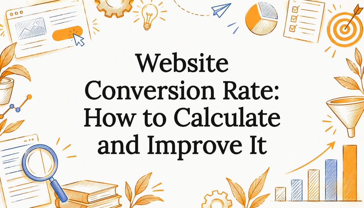

Website Conversion Rate: How to Calculate and Improve It
Your website conversion rate is the percentage of visitors who take an action you want, such as filling out a form, calling, or buying. You calculate it by dividing conversions by visitors and multiplying by 100. A good rate is one that beats your own baseline, and you raise it by removing friction on the pages that matter most.
If you run a small business, here is the uncomfortable truth: traffic you paid for, earned through SEO, or waited months to build is worth nothing if visitors leave without contacting you. Below is the formula, realistic benchmarks, and the changes we see move the number.
Table of Contents
TL;DR
- Formula: conversions divided by visitors (or sessions), times 100. Pick one counting method and keep it.
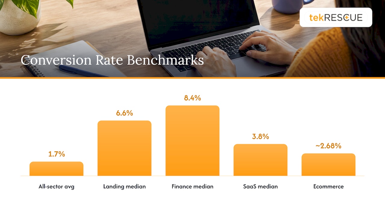
- Benchmarks: across sectors, one Q3 2025 data set puts the average at 1.7%. Landing pages show a higher median of 6.6%. Your best target is your own last quarter.
- Define the conversion first. For most service businesses it is a form submission, a call, or a booked consultation, not a page view.
- Fix friction: slow pages, vague calls to action, long forms, and weak trust signals.
- Test one change at a time and measure over a full period before you decide.
Table of Contents
- What a website conversion rate actually measures
- Choose the conversion that matters to your business
- What is a good website conversion rate?
- Why your rate may be low: the usual suspects
- Conversion-focused design: what to change first
- How to test changes without fooling yourself
- Do not forget traffic quality
- Our perspective
- Let us look at your site with you
- FAQ
- Sources
What a website conversion rate actually measures
Nielsen Norman Group defines the conversion rate as the percentage of users who take a desired action. The classic example is a visitor who buys something. The same source is clear that a conversion does not have to be a sale. It can be any key performance indicator that matters to your business: registering, subscribing, downloading, or requesting more information.
That matters because most B2B and local service companies never sell anything on the site. Your conversion is a lead.
The formula, with a worked example
The math is simple. Search Engine Land gives the example of 12 conversions from 1,000 visitors, which equals a 1.2% conversion rate.
Here is the same logic for a service business:
- Your site had 2,400 visitors last month.
- 48 of them submitted the contact form or clicked to call.
- 48 divided by 2,400 is 0.02, so your conversion rate is 2%.
Visitors, sessions, or users?
This trips people up. A visit-based rate divides by total visits and is, according to Shopify’s guide to calculating conversion rate, the industry standard for benchmarks. A user-based rate accounts for people who come back several times before they act. That is common in B2B, where a buyer may check you out on a phone, then again at a desk.
NN/g’s advice is to choose whichever method suits your site and count it the same way in every period. Consistency beats precision. A rate you can trust month to month is more useful than a perfect one you calculate differently each time.
Choose the conversion that matters to your business
Before you optimize anything, decide what you are counting. NN/g separates macro conversions, which directly serve your primary business goals, from micro conversions, the smaller actions that tend to come before them and happen more often. Unbounce suggests one macro goal plus a few micro goals that feed it.
A practical split for the kinds of companies we work with:
| Business type | Macro conversion | Useful micro conversions |
|---|---|---|
| Local service company | Phone call or booking form | Directions click, quote tool use |
| B2B or SaaS | Demo request or trial start | Pricing page visit, case study download |
| Agency or consultant | Contact form or booked call | Portfolio view, guide download |
| Ecommerce | Purchase | Add to cart, begin checkout |
The split comes from a conversion goals breakdown by site type.
Two cautions. First, do not average everything into one number. Geckoboard notes that with several conversion opportunities you can calculate the rate for each one separately or combine them. We prefer separate rates for lead forms and phone calls, because they behave differently. Second, make sure tracking actually fires. Our guide to privacy-first analytics setup covers GA4 configuration, including for sites that handle health information.
What is a good website conversion rate?
People ask whether 7%, 20%, or even 50% is good. The honest answer is that the number means little without knowing what was counted and who the visitors were.
NN/g’s position is that there is no single answer: a good rate is one higher than what you had before. Brand reputation, price, sales complexity, and the commitment you ask for all sit outside the design’s control.
Still, benchmarks help you sanity-check:
- All sectors: 1.7% average, from Q3 2025 data.
- Landing pages: a median of 6.6% across 41,000 pages analyzed in an Unbounce report.
- By industry: a MarketingProfs summary of landing page data shows a median of 8.4% for financial services and 3.8% for SaaS.
- By channel and device: the same data shows email traffic converting best at 19.3%, and desktop (12.1%) slightly ahead of mobile (11.2%), even though 82.9% of visitors arrive on mobile.
- Ecommerce: about 2.68%, usually between 2.3% and 3%, based on Dynamic Yield market data cited by Shopify.
Notice how wide the spread is. A homepage that gets cold search traffic will convert far lower than a landing page built for one offer and fed by an email to people who already know you. Compare like with like: a landing page against landing pages, a whole site against whole sites.
As for a 20% or 50% rate on a whole site, treat it as a sign to check the definition. Often a micro conversion such as a newsletter click is being counted, or traffic is so narrow (existing customers on a login page) that the rate says little.
Why your rate may be low: the usual suspects
When we audit a small business site, the cause is rarely exotic. It is usually a handful of the following.
Slow pages
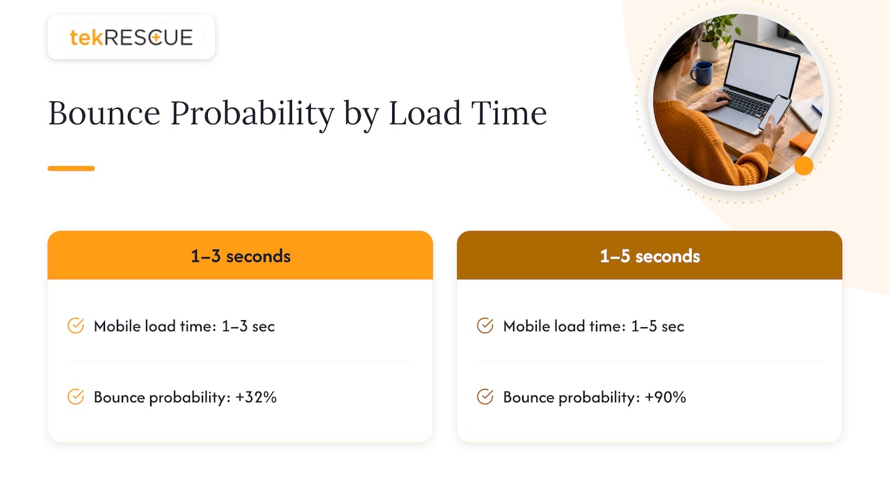
Speed is the quiet killer. In a Google-commissioned study, the probability of a visitor bouncing rose 32% as mobile load time went from one second to three, and 90% as it went from one to five. A visitor who leaves cannot convert. Cheap hosting and bloated templates are common causes. We cover the template side in why cheap website templates kill B2B conversion rates.
A vague or buried call to action
If a visitor has to hunt for how to contact you, many will not. Each page should have one primary next step, worded as a benefit or a clear action (“Get a security assessment”, not “Submit”), and visible without scrolling on a phone.
Forms that ask too much
Every extra field is a reason to quit. Ask for what you need to follow up: name, email or phone, and one open question. You can collect the rest on the call.
Weak trust signals
People hand over details to businesses that look real and accountable. Show your location, real team photos, reviews, certifications you actually hold, and plain-language descriptions of what happens after they submit. For a healthcare or financial site, visible security practices are part of trust, not an afterthought.
Mismatched traffic
A conversion rate is a ratio of two things that move independently. As Trckable’s glossary points out, a rate that rises while visitors fall may mean you lost casual browsers and kept serious buyers, and a drop after a big launch often reflects a different kind of visitor, not a worse page. Read the rate alongside traffic sources before you blame the design.
Conversion-focused design: what to change first
Conversion-centered design means giving every element a purpose tied to a goal. Mailchimp’s overview lists the working parts: strategic calls to action, focused landing pages, simple forms, streamlined user flow, trust signals, and feedback mechanisms, all backed by data and testing.
Here is the order we would work in for a typical small business site.
- Fix speed and mobile layout. Nothing else matters if the page loads slowly or the button is hard to tap.
- Clarify the headline. Within a few seconds a visitor should know what you do, who it is for, and where you do it.
- Give each page one job. A service page should push toward one action. Our walkthrough on building an effective landing page shows how to strip a page down to that job.
- Shorten the form and put it where interest peaks, usually after the proof, not before.
- Add proof near the action: a testimonial, a certification, or a short case study beside the button.
- Make contact easy: a tap-to-call number on mobile and clear hours or response expectations.
For more depth, see our posts on five essentials that bring more leads and conversions and how a website is built to convert visitors. If you sell online, web design practices for ecommerce stores covers product pages and checkout.
Use behavior data, not opinions
Guessing which part of a page loses people is expensive. A heat map shows where visitors click, how far they scroll, and what they ignore. We explain how to read one in using heat mapping to improve conversion rate optimization.
How to test changes without fooling yourself
Search Engine Land recommends starting with A/B testing: form a hypothesis, decide what to change, work out how many users you need to see a clear winner, and set how long the test runs.
Some rules we follow:
- Change one thing at a time. If you rewrite the headline, button, and form together, you will not know which mattered.
- Write the hypothesis first. For example: “A shorter form will raise submissions because fewer fields mean less effort.”
- Run it long enough. NN/g suggests a month as a measurement period when you want a single answer. Low-traffic sites may need longer to see a reliable difference.
- Keep the counting method fixed so before and after are comparable.
- Record results, including the ones that fail. A flat test still teaches you something.
Low traffic is the real limit for many small businesses. If you get a few hundred visits a month, formal split tests will take a long time. In that case, make well-reasoned fixes from heat map and analytics evidence, then compare monthly rates. Our post on A/B testing, conversion rates, and data analytics goes further, and conversion rate optimization and why it is necessary lays out the wider process.
Do not forget traffic quality
Conversion work and visibility work feed each other. Better design turns the visitors you already have into leads. Strong search engine optimization brings more of the right visitors, the ones searching for exactly what you do. If your rate is fine but leads are low, the bottleneck is traffic. If traffic is healthy but leads are low, the bottleneck is the site. Knowing which one you have saves budget. With AI search sending visitors in new ways, it is also worth checking how that traffic shows up in your reports: see decoding AI traffic in Google Analytics 4.
Our perspective
We see the same pattern across small and mid-sized businesses in Central Texas. The owner has invested in a site, maybe in SEO too, and the phone is still quiet. The instinct is to buy more traffic. Usually the better first move is to look at what happens after the click.
Our view is that a website is business infrastructure, not a brochure. It has to load fast, state your offer clearly, protect visitor data, and make the next step obvious. That last part matters most for healthcare practices and professional firms, where visitors weigh trust before they ever fill out a form. A site that handles their information carefully and says so plainly earns more conversations.
That is why we build design, SEO, and security thinking into the same project. A custom site designed around one conversion goal per page, measured with clean analytics, gives you something you can improve month after month. Template sites rarely give you that room.
If you want your numbers to move, define the conversion, measure it honestly, fix the biggest friction point, and repeat.
Randy Bryan
Let us look at your site with you
If you would like help turning more of your visitors into inquiries, our team designs and builds custom sites with conversion goals in mind, and maintains and hosts them afterward. Learn more about our website design and development services, or see how we handle the journey from idea to launch.
FAQ
Is 20% a good conversion rate?
It can be, but only for the right kind of page. A targeted landing page fed by an email list can reach very high rates, since the MarketingProfs data shows email-driven landing page visitors averaging 19.3%. On a whole site with mixed traffic, 20% usually means a micro conversion is being counted. Check your definition before celebrating.
How long should I wait before judging a change?
NN/g suggests using a month as the measurement period for a single answer. Keep the period and counting method the same before and after the change. If traffic is low, extend the window.
What is the fastest way to improve website conversions?
Start with the basics: page speed, a clear headline, one obvious call to action per page, and a shorter form. These remove friction without a redesign. Then use analytics and heat maps to find the pages where visitors drop off.
Should I track phone calls as conversions?
Yes, for most local service businesses a call is a macro conversion. Track it separately from form submissions so you can see which path brings more leads. Tap-to-call buttons and call tracking make it measurable.
Does conversion rate differ between mobile and desktop?
Often. One landing page data set shows desktop at 12.1% and mobile at 11.2%, while most visitors arrive on mobile. That makes mobile layout and speed a priority for any site.
Sources
- Conversion rate optimization (CRO) strategy for 2026, HubSpot
- Conversion Rate: Definition as used in UX and web analytics, Nielsen Norman Group
- Macro vs. Micro Conversions, Nielsen Norman Group
- How to measure and optimize conversion rate, Search Engine Land
- Calculate Conversion Rate: Formula and Tips, Shopify
- Website Conversion Rate KPI, Geckoboard
- Conversion marketing: The basics explained, Unbounce
- Conversion Goals: Examples, Setup and Realistic Targets
- Landing Page Conversion Benchmarks for 2024, MarketingProfs
- B2B conversion rate optimization, Unbounce
- Ecommerce Conversion Rate Optimization Strategies, Shopify
- Milliseconds Make Millions, Think with Google
- What is conversion rate?, Trckable
- Tips for Successful Conversion-Centered Design, Mailchimp
Recommended
Table of Contents